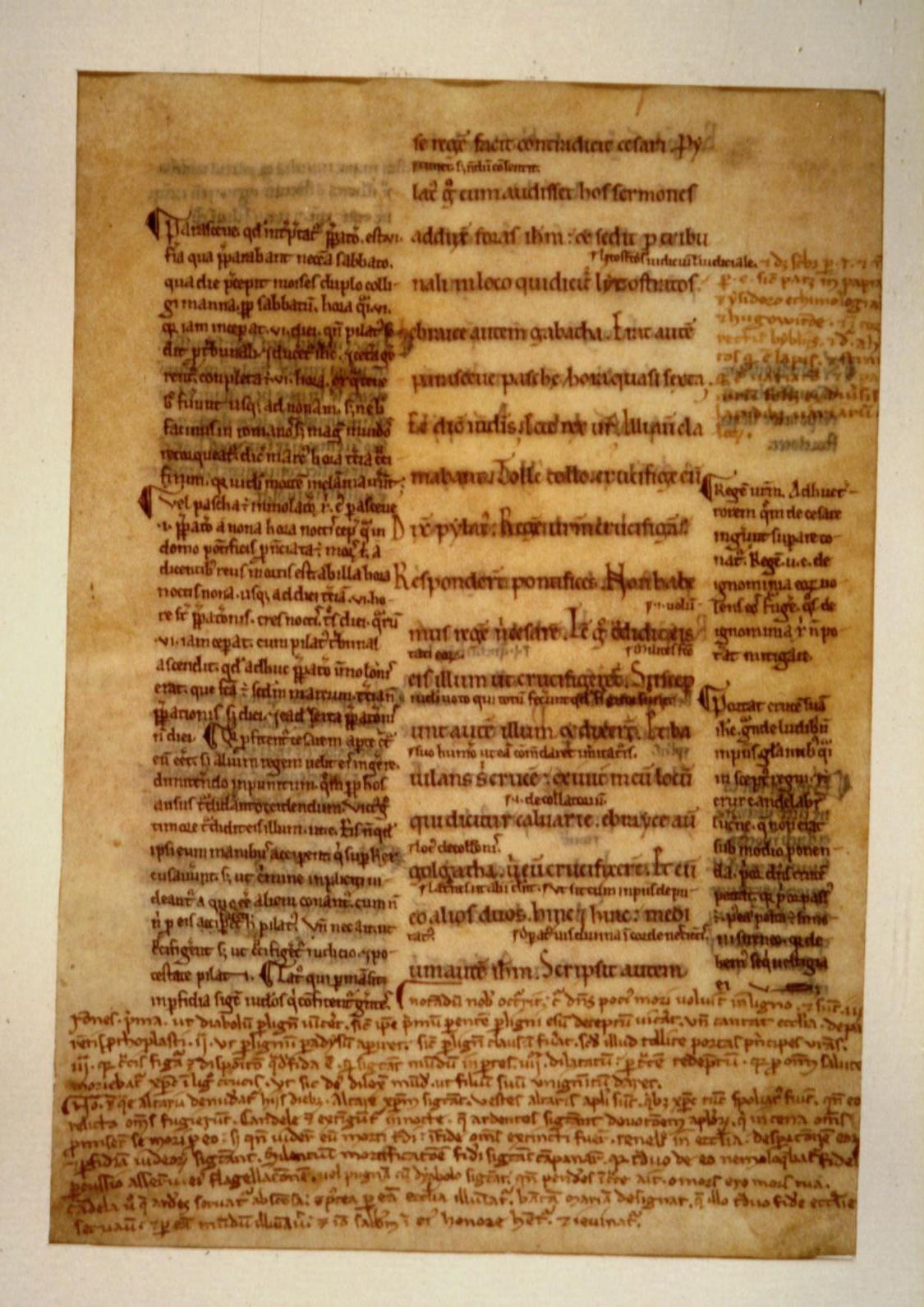
"Early printed editions were set in typefaces made to imitate handwriting in medieval Byzantine manuscripts, an orthographic system (= "way of writing") much changed since ancient times, with many abbreviations and ligatures in which more than one letter is combined into a single sign.
Certainly Plato could not have read the first printed text of Homer, nor can a modern scholar without special training, even a professor who has spent an entire lifetime teaching and studying Greek.
In the 19th century, modern printed typefaces and orthographic conventions replaced those based on manuscripts handwritten in Byzantium before the invention of printing, but in no sense did such modern conventions attempt to recreate the actual appearance, or material nature, of an ancient text of Homer.
For example, the forms of the Greek characters in T.W. Allen's standard Oxford Classical Text, first published in 1902, imitate the admirable but entirely modern Greek handwriting of Richard Porson (1759-1808 [by which the Porson Font is named]), a Cambridge don important in early modern TC.
Complete with lower and upper-case characters, accents, breathing marks (that is, pronounced with an H or without), dieresis marked by two horizontal dots (separate pronunciation of contiguous vowels), punctuation, word division, and paragraph division, such Greek seems normal to anyone who studies Greek, say, at Oxford or Wisconson U today. Here is what the 1st seven lines of the Illiad looks like in a modern printed type (from Loeb):

If you study Greek today, and take a course, you will expect to translate such a version. You are reading "Homer" you think, but in fact the orthography, the way things are written, is a hodgepodge that never existed in the 19th century A.D. A full accentual system, only sometimes semantic ("with meaning"), does not appear untile around 1000 A.D. in Greek writing and is never used consistently. The distinction between upper and lower case letters is medieval.
Porson's internal sigma [inside words] is drawn σ, but in the Classical Period the sigma was a vertical zigzag Σ (hence our "S") and after the Alexandrian period always a half-moon shape C (the lunate sigma"); the shape σ appears to be Porson's invention. The dieresis, or two horizontal dots to indicate that vowels are pronounced separately (e.g. προοιαψεν), is a convention of recent printing. Periods and commas are modern, as is word division, unknown in Classical Greek.
The Oxford text would have mystified Thucydides or Plato just as much as the first printed text based on Byzantine conventions. The much earlier, we might say original, text of Homer would have puzzled them just as much, which seems to have looked something like [below]:

The direction of reading switches back and forth from right to left, then left to right (called boustrophedon writing, "as the ox turns"). In the earliest form of Greek writing, as we reconstruct it from meager inscriptions, there is no distinction between omicron = short o and omega = long o, or between epsilon = short e and eta = long e. and doubled consonants are written as single consonants. there are no word divisions or upper and lower-case letters, or diacritical marks such as accents, or capitals of any kind.
In reading such an early text the exchange of meaning from the material object to the human mind takes place in a different way from when we read Homer in Porsonian Greek orthography or English.
The philologist is keenly interested in how this might have worked. Apparently the Greek reader of the 8th century B.C. was decoding his writing by the ear. For this reason the ancient Greek felt no need for word divisions or line divisions or diacritical marks or paragraph markers or quotation marks because to him the signs represented a continuous stream of sounds. A thousand years after Homer the Greeks still did not divide their words. (In Latin, words were often divided from the earliest times. )
When we read Greek (or English), by contrast, we decode the test by the eye. We are deeply concerned where one word ends and another begins. The appearance of our texts is semantic, it carries meaning, as when a capital letter says "A sentence begins here" or a space says "the word ends here". Our text of Homer is directly descended from an ancient Greek text, yes, but the text works for us in a different way.
When modern philologists attempt to recover as closely as possible an "original text", as editors claim, in fact they never mean that they are going to reconstruct an original text, that Homer might have recognized. Rather they represent an interpretation of how an original text might be explained according to modern rules. What appears to be orthography, in a modern text, "the way something is written", is really editorial comment on meaning and grammatical syntax. If editors gave us the original, no one could read it."
(p 7-8)
--------------------------------------
--------------------------------------
mr.scrivener