Showing posts with label Palaeographic Dating. Show all posts

Thursday, May 26, 2011

Uncial Talk (5) - Greek Script: Ullman

The following is from B. L. Ullman, Ancient Writing and Its Influence (1932):
"Chapter VI: The Development of Greek Script
...
The papyrus finds of Egypt have furnished us with material for a study of Greek writing from the 4th cent. B.C. to the 8th cent. A.D.  Essentially there are two styles -- the literary book-hand and the cursive hand of everyday use.  These interact on each other from time to time.   The book-hand starts out with a character very similar to that of the inscriptions, as may be seen from the 4th cent. MS of Timotheus.   In the 3rd century, as a result no doubt of cursive influence, it becomes Uncial, i.e., some fo the letters become rounded.

First Σ becomes C; next E becomes e, and Ω becomes ω.  Soon after we find Z for  I ,  and α for A, and this eventually becomes a.  At the beginning of our era M has become U, the typical later Uncial form.   Under obvious cursive influence the three strokes of Ξ becomes ξ.  Thus we see a gradually developing uncial script from the 3rd century B.C. to the 2nd century A.D.

In the 2nd and 3rd centuries we find side by side with the broad Uncial a sloping, compressed Uncial, much as today we find vertical and slanting forms of writing side by side. 

In the meantime there arose a cursive hand, used for business purposes, in which letters were written together instead of separately.  This was at times written quite as carefully as the book-hand, just as our cursive hand also has its regularized type form, called "script".  The details of its evolution are of no interest to us here.  It is sufficient to point out that the changes in the the book-hand were due to its influence.  We can definitely say, for example, that the round alpha came into the book-hand from the cursive, for it is found two centuries earlier in cursive than in the book-hand.  Similarly with other letters.
It seems to be true that the chief borrowings from cursive came at two periods, one about 300 B.C., when Alexandria became the most important city of the Greek world, and the other nearly 300 years later, when the Romans took over Egypt.
It is natural that new political situations should affect the style of writing; history shows many such examples. 
To the earlier of these two periods we owe the forms ε C ω;  to the latter, a U ξ.   It is also worth noting that not all cursive forms affected the book-hand, but those which did generally required a century or two to succeed.  It is not impossible that Roman writing had an influence on both cursive and book-hands in the earlier period as it surely did in the later.

The earliest parchment MSS that have survived date from the 3rd or 4th century A.D.   They are written essentially in the Uncial characters of the papyrus scrolls.  But the new material led to a differentiation in that it permitted the shading of letters to a much greater extent.   It is true that some papyri show shading, but this probably is due to imitation of writing on parchment.  The ambrosian Homer of the 3rd or 4th century is thought to be our earliest example of a parchment book.   Other MSS of the 4th cent. are the Vatican and Sinai Bibles; the Codex Alexandrinus is attributed to the following century. 
Codex B (Vat. 1209)


Compressed, Sloping Uncial Script: 

The handsome, broad Uncial, with its square and round letters, continued to be used until about the 6th century, and was contemporary with its Roman counterpart.  But the sloping, compressed Uncial found in the papyri was also used on parchment, though at first it was less common.  The reason is obvious: it is a time and space-saving script, and in the earlier centuries, at least in Egypt, parchment was still the more expensive material and was used only when saving of time and space was not a consideration.  The most important early MS in sloping Uncials is the Washington (Freer Codex W) MS of the Gospels, which is thought to have been written in the 4th century.   This style of writing eventually became the dominant type.    It developed as its chief characteristic very heavy lines contrasted with fine ones and teneded to become pointed, like the Gothic style of Roman writing.   Upright forms with the same characteristics are also found.   This type, which became common in the 9th century, is called Slavonic Uncial because it formed the basis for the alphabet used in the Slavic languages.  After that the Uncial became more and more artificial.   It lasted in an upright form until about the 12th century. 
Codex W


The Minuscule Hand:

With the 9th century we come to a crossroads in the history of Greek writing.   The main road of Uncial goes on, but its traffic is that of the Slavic alphabet.   The Greek traffic is diverted to a road that before crossing the main road was little known but now becomes the main highway for the Greek alphabet.   That road, known as the cursive before it crosses the other highway, is the minuscule. 

It is only necessary to examine the highly artificial Uncial writing of the 10th or 11th century to see that something was bound to happen.   Writing such as this could not last.  It is not surprising therefore that in the 9th century a minuscule style of writing based on the old cursive came into use as a formal book-hand.

This style of writing, called "old minuscule", is at its best in the 9th and 10th centuries.  Though the letters are connected, there are no extreme ligatures; many of them involve the letter sigma.   The letters are well rounded.  In shape they are in general similar to modern Greek minuscules, except beta, which is similar to our u;  zeta, which  is at first like our 3, later has the Uncial Z form; eta, which is like our h; kappa which looks like our li without a dot; nu, which is round at the bottom like a mu without the last stroke.; pi, which has the form ω. 
 The script may be compared in general with the Caroline minuscules of the Roman alphabet in the 9th and 10th centuries, to which it possibly owes its inspiration.   The 9th century is noteworthy also because the use of accents and breathings becomes general, in both Uncial and minuscule manuscripts. 
[insert Vat. Gr 190]
 
Later Minuscule Styles:
In the following centuries we find what is called the "middle minuscule", whose chiefe characteristic is the use of the Uncial formst of many letters, especially beta, eta, and kappa.  We are on the way to a welding of Uncial and minuscule scripts.   At times it seems as if  the result might e a cursive Uncial.   In fact Uncial forms of every letter can be found in one or another MS of this period, but they are joined together in the cursive manner.   Ligatures and abbreviations become more numerous. 
[plate V Pierpont Morgan Lib. MS 639, 12 cent. Gosp.]


From the 13th century on we have preserved to us a number of more carelessly written MSS, filled with ligatures and abbreviations.  In this respect the script recalls the contemporary Gothic of Western Europe, though in appearance they are quite unalike.  SOme letters have many shapes in the same MSS; most have at least two.   It was a period of formlessness and carelessness, produced or at least assisted by political turmoil.  Furthermore, the introduction of paper, the new cheap writing material, was responsible for a lesser degree of care in writing.  

[Vat. Gr 144 1439 A.D.]

 With the reawakening of interest in Greek in 15th cent. Italy, Greek scholars and scribes came to Italy, especially after the fall of Constantinople in 1453.   Naturally they  brought with them the undesirable writing then current.
It was this unfortunate time that printing began, and the early Greek books printed in Italy preserve all the numerous ligatures and other peculiarities of this writing.   In the course of centuries the printed forms gradually became simplified under the influence of the Roman script, but it was not until the 19th century that all ligatures disappeared.    Even so the present printed form of Greek is less beautiful and less legible than Roman type.   As Rutherford said: 
"Nothing could well be imagined less likely to call up ideas of art or beauty than a modern page of printed Greek."  
Very recently there have been suggestions in Greece that the Greek alphabet be abandoned in favor of the Roman for the printed and written forms of modern Greek.  Unfortunately it is unlikely by reason of national pride that this movement will make much headway. "
(Ullman, p. 46-56)

mr.scrivener

Monday, May 2, 2011

Uncial Talk (4) - MS Illumination, C. Nordenfalk

Croatian Initials
Again we continue the series with a short quotation from another great book on the history of manuscripts, Book Illumination, Early Middle Ages, by Carl Nordenfalk, Curator, Nat. Mus. Sweden (1957, 1988, 1995). 
"...But though the art of the illuminated MS was typically medieval, it was not, like the stained-glass window for example, invented in the Middl Ages.  Long before this, in ancient Egypt, the papyrus rolls...were supplied with colored illustrations.  And though the Greeks of the Hellenistic Age did not give illumination a leading place... there can be no doubt that illustrations often figured in their books.  ...as guide-marks..these were all the more useful since in early MSS columns were not numbered [or indexed].
During the 2nd - 4th centuries A.D. the papyrus scroll was gradually supplanted by the vellum codex, which furnished new support for illustrations...for portraits of authors, ...inserted in the columns of text, usually without frames or backgrounds. 
The oldest extant miniatures in painted frames date without exception to the 4th century A.D. ...when classical culture was beginning to decline.  the 'illusionist' technique of antique painting...perpetuating the art of previous centuries...was particularly striking during the Carolingian renaissance.   The Roman Calendar for 354 A.D. is a case in point; nothing of it survives, but we have 16th-17th cent. Carolingian copies...reproduced so faithfully that one is hardly conscious of the intervention of the Carolingian copyist. 
We learn from Egyptian papyrus that in book rolls of the Hellenistic epoch it was already customary to frame tabular texts with ornamental colonnettes. 
A richly decorated Bible was used as a model by painters at Tours in the 9th century.  Four large-size pictures, to fo rthe Old and two for the New Testament, sponsor an interpretation of the doctrine of Redemption, intended to counterblast the Manichean heresy, possibly a 'proclamation' of Pope Leo the Great (440-461 A.D.).   Classical details such as heads and gestures, ...perspective, link up with earlier MSS.  ...however, ...the tendency to bring figures forward, and diversity is replaced by smaller selection of types...the beginnings of a new pictorial language that, after gaining ground in the late 5th century, attained its culmination in the reign of Justinian.  
...
During the 6th century book production passed more and more into the hands of the Church and the copyists were chiefly employed on making Gospel Books.  But the time was not yet ripe for a final break with the art tradition of antiquity.  Judging by surviving works, the only decorative elements of the Gospel Books in 4 / 5 cases were limited to simple linear ornaments around the colophons.  only the Canon Tables or "concordances", invented by Eusebius of Caesarea (d. 340 A.D.) formed a real exception, having decorative arches.  This type of decoration soon became standardized, and Jerome employed them in the West for his new Latin Vulgate.
That no examples earlier than the 6th century are extant can be explained by the pillaging of Italian churches in the intervening period.  ...
During the period before political upheavals and pariticularly the Arab invasions of the 7th century had almost extinguished the art of the illustrated book in the Latin countries around the Mediteranean basin, an important atelier somewhere in southwest Europe produced a MS whose full-page pictures excel those in all others of this period, the so-called Ashburnham Pentateuch. " (selections abbrev., p. 1-24)


mr.scrivener

Sunday, April 17, 2011

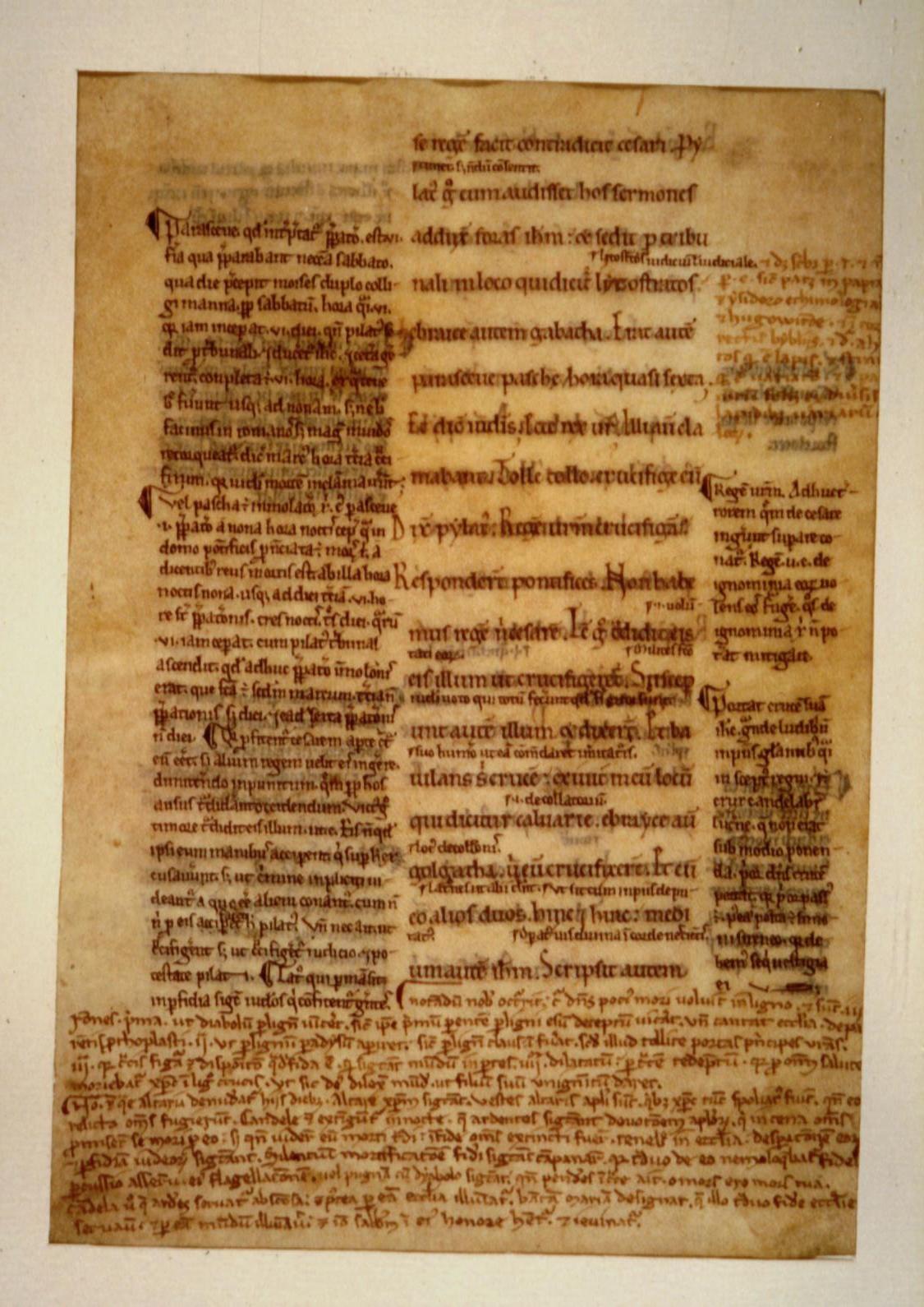
Dating MSS by Vellum Color

Some brief notes are recorded here for the assistance of palaeographers:

From:  THE OTTO F. EGE PALEOGRAPHY PORTFOLIO page

1. Switzerland: New Testament ( Testamentum Novum, cum Glossis Bedae, Hieronymi, et Gregorii).
Early XIIth Century. Latin Text; Revised Carolingian Script.
John 19.7-12, recto; John 19:12-19, verso.
... interlinear glosses and commentaries from the writings of Bede, Jerome, Gregory and other Church Fathers. These were inserted at various times during the following century around a central panel of the original text. All hands based on revival of early Carolingian minuscule. the beginning of the trend to compactness and angularity is seen in many of these later additions. 

'The colour and texture of the vellum is frequently an aid in allocating a manuscript to a certain district and time. The XIIIth century skins are often yellower than those of later dates as the result of the fact that a weaker lime-water solution was used in the bleaching process.'


3. Italy: Lectionary (Lectionarium; Secundam Lucam)
Middle XIIth Century, Latin Text; Revised Carolingian Script

 
A Lectionary contains selected readings from the Epistles and Gospels as well as the Acts of the Saint and the Lives of the Martyrs. These were read by the sub-deacon from a side pulpit. This practice necessitated that they be written in a separate volume, apart from the complete Missal. This fine large bookhand shown here, suited to easier reading in a dark cathedral, is a revival of the script developed nearly four centuries earlier in scriptoria founded by Charlemagne. Maunde Thomson calls this Lombardic revival the finest of all European bookhands. Even the XVth century humanistic scribes could not surpass it for beauty and eligibility.
 
The tone or hue of ink frequently helps allocate a manuscript to a particular district or century. Ink of brown tone is generally found in early manuscripts, less frequently after 1200 A.D.
 

"The quills used in writing were obtained from the wings of crows, wild geese, and eagles. To keep them sharp and their strokes of uniform width required skill and great sensitivity in hand pressure. It would be difficult to imitate or approximate the fine details even with the special steel lettering pens of today."

mr.scrivener

Thursday, April 7, 2011

Uncial Talk (3) - M. Brown

We continue our survey of Latin Capitals and Greek/Latin Uncials with some more observations of value from Michelle Brown's book, A Guide to Western Historical Scripts from Antiquity to 1600 (U of T press, 1993);


Rustic Capitals (cont. from our previous post)

Vat. Lat. 3867, Vergilius Romanus:  (c. 4th  century  A.D.)


"Script:  An elegant example of Rustic Capitals, written with great fluidity of the pen and with a tendency towards calligraphic flourishes (seen in the treatment of the heads of F and X and the descent of L below the line).  Bows are minimal.  Note the curved head of the secnond minim of H, another scribal feature.  Curvaceous feet are systematically applied to minims.
Punctuation is by the medial punctus (centre-dot) which imposes word division, rather than the more usual scriptura continua, in the manner of monumental epigraphic inscriptions.
The Column Picture is an increasingly popular element of de luxe manuscripts from the 4th century onwards.  The naturalistic impressionism of antique painting is beginning to give way to a more linear and stylized approach."
Two important points noted above are:

a)  Spaces between words were already commonplace in Latin and Greek writing by the 4th century.  Thus the presence of spaces cannot be used to indicate later dates for manuscripts.

b)  Even such fancy adornments as full column-width pictures embedded into the text were also popular features from the 4th century onwards.  

The significance of this is that manuscript decoration and production was already quite varied and sophisticated even in the 4th century, and so this feature cannot be used to assign later dates to manuscripts with such features, nor can their absence be used to date manuscripts to the 4th century or earlier.

Especially important is that any discussion of decoration and/or pictography or the lack of it must be done in the light of the controversies re: icons, which occurred after this period.  Many manuscripts containing "idolatrous" icons and pictoral decoration were destroyed during the "Iconoclasm" battles, which would have provided a more complete picture of scribal practices for earlier periods.


mr.scrivener

Saturday, March 26, 2011

Ligatures and Tachygraphy

There is an intimate relationship between the ligatures (connected writing) introduced in the 8th century A.D. alongside the Minuscule script, and longstanding Tachygraphy practices (shorthand, symbols) among Greeks and Romans.

The first and most obvious case of tachygraphy (shorthand) is the Abbreviations and Symbols used for the Sacred Names (Nomina Sacra), which were introduced way back in the 2nd century at the start of the spread of Christianity.  These are found in just about every early surviving manuscript.   But only a handful of words were so shortened.  Things didn't apparently proceed much further than that for many centuries, even though Roman tachygraphy (shorthand) was known and practiced by military and governments even from the time of Jesus.

But in the 8th century with the development of a formal and organized minuscule script (smaller connected handwriting), the opportunity was taken to make extensive use of many special symbols, which represented common letter combos and were easy to write and rapid to execute on parchment.
Here are a good selection of samples, without which it would be hard to read many later copies of the NT writings:

By Ligatures are meant combinations of letters made for the sake of speed-writing rather than symbols encompassing the meaning of a word or words (i.e., Abbreviations & Symbols.  For those see further below):

Ligatures
Click to Enlarge: Backbutton to return
Standard
Ligatures
Later
Ligatures

Special 
Superpositions

Ligatures were made according to set rules, which were almost always followed in early minuscule MS (8th cent.).  As uncial letter forms were mixed in with pure minuscule (for instance beta, kappa, pi), ligatures were created combining both forms.  In some case super-positioning (placing one letter above another) created yet more new forms.  - Source: B.A. van Groningen, Short Manual of Greek Palaeography, (Leiden: 1940)

We have enlarged and enhanced the original scans from the fordham.edu website, for readability.  Just click on them to see the examples better.

The following abbreviations and symbols (representing meanings of words/concepts) and examples of actual tachygraphy will also be extremely useful:

Click to Enlarge

Click to Enlarge

Tachygraphy Symbols (Shorthand) often repeated words


mr.scrivener


Wednesday, March 23, 2011

The Sudden Conquest of the Minuscule Script c. 780-820 A.D.

Upensky Gospels MS: GA-461 (c. 820) - Sample page


I am borrowing this great excerpt on the Upensky Gospels to open the discussion:
"The earliest surviving dated example of Greek minuscule is the Uspensky Gospels manuscript. The codex was probably written in Constantinople by monk named Nicholas. Later it belonged to the monastery of Great Lavra of St. Sabas, known in Arabic as Mar Saba, a Greek Orthodox monastery overlooking the Kidron Valley in the West Bank, east of Bethlehem in Palestine. In 1844 bishop Porphiryj Uspienski took it along with other manuscripts, including a portion of the Codex Coislinianus, to Russia. The Uspensky Gospels MS is preserved in the National Library of Russia in St Petersburg (Gr. 219. 213. 101)." ( - from Cave Paintings to the Internet)

Further enlightenment on the changeover comes from Reynolds & Wilson:

"As the script of this book (GA 461) is by no means immature or primitive, the adoption of this style should probably be dated at least half a century earlier. The place of its origin is not known for certain, but there are some grounds for thinking that it was popularized by members of the important Stoudios monastery in the capital [Constantinople], which a was a well-known centre of book production at a later date. Gradually the uncial hand was abandoned, and by the end of the 10th century it was no longer used except for a few special liturgical books. The new script facilitated the copying of texts by making more economical use of parchment . . . .

"The transliteration of old uncial books into the new script was energetically undertaken by the scholars of the 9th century. It is largely owing to their activity that Greek literature can still be read, for the text of almost all authors depends ultimately on one or more books written in minuscule script at this date or shortly after, from which all later copies are derived; the quantity of literature that is available to us from the papyri and the uncial manuscripts is only a small proportion of the whole. In the process of transliteration mistakes were sometimes made, especially by misreading letters that were similar in the uncial script and therefore easily confused. 
 
The Changeover Process:
At many points in Greek texts there are errors common to all the extant manuscripts which appear to be derived from the same source, and this source is usually taken to be a ninth-century copy. 
 
A further assumption generally made is that one minuscule copy was made from one uncial copy. The uncial book was then discarded, and the minuscule book became the source of all further copies. The theory has a certain a priori justification on two grounds, since the task of transliteration from a script that was becoming less and less familiar would not be willingly undertaken more often than was absolutely necessary, and there is at least some likelihod that after the destruction of the previous centuries many texts survived in one copy only. But these arguments do not amount to proof, and there are cases which can only be explained by more complicated hypotheses" (Reynolds & Wilson, Scribes and Scholars 3rd ed ([1991] 59-60).


mr.scrivener

Uncial Talk (1) Greek and Latin - M. Drogin

In TC, there is often a lot of vague talk and inaccurate use of various terms regarding scripts and styles.   We seek to expand our knowledge of the background with a series here on the various scripts, starting with Uncials.   Sometimes we see "Uncial" and "majuscule" used interchangeably, but I think we can gain precision by consulting those historical investigators of calligraphy.   For openers, I will quote a nice introduction by Marc Drogin, from his book, Medieval Calligraphy (1980):


 Uncial Script - 3rd to 6th Century


Brief History

"In the 1st and 2nd centuries the scribes of Europe wrote most formally in Roman Square Capital and less formally and more conveniently in Roman Rustic.

ROMAN RUSTIC CAPITALS   ca. 4th century

From the square Roman capitals (preserved on the plinth of Trajan’s Column (114 AD),
developed the freer-form and slightly more condensed Rustic capitals. 


Their subject matter was almost wholly non-Christian.  In Rome, Greek manuscripts predominated, since Latin had yet to become the official Church language.  With the demand for church-related manuscripts, it was probable that the primary source was the intellectual community of North Africa, where Latin was the literary language of the Church and the population knew both Latin and Greek.  The scribes there sought an appropriately dramatic Latin script suitable to the importance of their new religion, but some changes had to be made so such a script could be produced more rapidly to fill the demand for manuscripts.  Since the pen more easily and rapidly produces curves than straight lines and angles, scribes began adopting some of the round strokes which were a hallmark of the formal Greek script since the 3rd century B.C.


This adaptation resulted late in the 2nd or early in the 3rd century in a script as majuscule and important as Roman Rustic, but now with its letters wide and curved, reminiscent of the finest Greek formation.  When the Church in Rome adopted Latin as its official language and sought to represent itself in a script both different from the pagan literature's Roman Rustic but familiar to people accustomed to that script or accustomed to Greek-Uncial, a formal but quick script was the obvious  choice.  By the 4th century it had become an established script for manuscripts of importance, and by the end of the 5th century it had eclipsed the pagan scripts and reigned supreme."  (Drogin, p. 93)

Latin Cod. Bobbiensis (k) (c. 400 A.D.)


Latin Uncial  -  circa 5th century


Click to Enlarge


MS GA-087 - Θc (6th cent) - Click to Enlarge


mr.scrivener

Monday, March 21, 2011

Codex W and Greek Enoch? ...I don't think so

In his palaeographic analysis, Sanders (1912) compared Codex W to several older Greek manuscripts, including P. Cair. 10759. (Greek Enoch, Gosp.Peter etc.).  To give a standard sample for manuscripts of this early period, we offer the following example, P. Chester Beatty XII, leaf 3:
Typical earlier Greek Papyrus:  Click to Enlarge
The first thing to note about early calligraphy, is the startling difference between using a soft brush or reed (earlier papyri) and using a hard nib or quill (4th - 5th century and beyond).   This stylizes the writing more than any other single factor.   Its the difference between painting, which is soft and blob-like, allowing the ink/paint to flow and leading it with the brush, versus the firm and hard controlled strokes of the pen, using a thinner more ink-like medium.

paint-brush versus quill  - Click to Enlarge

This softer paint-like writing was practically necessary, because of the relative roughness and fragility of papyrus, which was a primitive paper-like material, as opposed to later parchment and vellum (animal skins).

It is true that sometimes the early Egyptian scribe using papyrus would give a slight to moderate tilt or angle to the letters, but this varies from scribe to scribe, and can hardly be defined even as a conscious choice.   The tilt is probably based on practical factors like right- or left-handedness, and not issues of style at all.   The early slight to moderate tilt may be quite noticeable in more extreme cases, but does not seem to be a choice based on anything but writing convenience and speed.   There is no dispute however, that slanted writing was popular quite early, as a few samples of P45 can illustrate:


P45 - Click to Enlarge
Again, the thickness of the letters may vary widely, from elegant like this, to bloated and clumsy, but the same 'painted on' look dominates the calligraphic style and feel, regardless of incidentals like letter-shape or tilt.   As well, P45 (or the group of pages so designated) involves a variety of books and hands, all dated roughly to the 3rd century, of which only Luke/Acts is tilted.   It is not possible to make any conclusion at all regarding date based on tilt or angle of writing.

 P45 wasn't available to Sanders (P45 was discovered in 1930), but probably would have been preferred by him as an example of early slanted writing over the Greek Enoch fragments from P. Cair. 10759 below:

Papyrus Cairo 10759
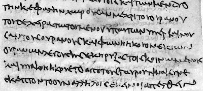
Gospel of Peter  (Click to Enlarge)
Enoch (Click to Enlarge)
 P. Cair. 10759 also spans several books and hands, but the Enoch pages have the closest similarity to Codex W.   Of particular interest is one feature, namely the variation in line thickness based on the angle of the 'nib' or quill used to write the letters.   This itself seems to suggest a much later date for this section of 10759, than may have been at first assigned to it.   The other pages (e.g. Peter) show instead the typical 'painted on' look of a brush-like implement or soft quill.   Indeed, Enoch resembles more the typical hand of the late 3rd or 4th century scriptorium than the early papyri.

We have already referred to Schmid's excellent and thorough article in  The Freer Biblical Manuscripts (2006), Ed. Larry W. Hurtado, and we will quote his passage of Sanders here:
"Hand 'c' [of Enoch] bears a much closer resemblance to the hands of W...The ease, grace, and slope of the hand remind one strongly of the first hand of W, but the shapes of many of the letters, notably  γ ε κ μ σ ω  are far closer to [the 1st quire of John in W]. I see no reason for not considering the two hands of the Enoch fragment contemporary.  It [Enoch] has been dated to the 6th century, but though both hands are somewhat more developed types than the hands of W, I should not place the date later than the end of the 5th [century]." (Sanders, 137-8, in Schmid, p. 239)
Here Sanders is already jockeying to secure an earlier date for his Codex W, but the problem of the anachronism of P. Cair. 10759 is quite glaring!  -  It has already been dated to the 6th century A.D., and yet it is probably the closest thing to Quire 1 of John in Codex W we are ever going to find.  In other words, despite Sanders' cleverness, this is really evidence for dating W to the 6th century palaeographically, not the 5th century.

And if so, trying to make Codex W the archetype of other 5th/6th century witnesses is a naive and flimsy proposal.   But why does it matter?   Because Codex W is now no longer an early "4th or 5th century" witness to other palaeographic features, such as outdented and enlarged letters, slanted varying-width styles, etc.  - But rather, a very late witness.

mr.scrivener